WOW, we got one more day so its time to make this day awesome by learning something new ? .
Hello guys, hope every body is doing good. We already learned a lot of new things about Constraint Layout in part1, part2 and part3. Now Its time to start learning about remaining things. By the way this is our final post in Constraint Layout ( What the hell is this) series.
Motivation:
Motivation is same as discus with you guys in part1. Now in this post we are going to play with Visual Editor. On some places I will refer part2 of this series. I am going to use all previous concepts, which we already discuss in XML or Java, to implement by using Visual Editor. In this way we can save a lot of time.
We need to download 2.3 Android studio. In previous versions Visual Editor is not good and that show some wrong info on Design Tab. So that is really important download 2.3 beta which is available when I am writing this post.
Introduction:
In this post we are mostly working with Visual Editor. There is a rare chance you will work with XML. So attach your mouse, increase brightness of your monitor and attack.

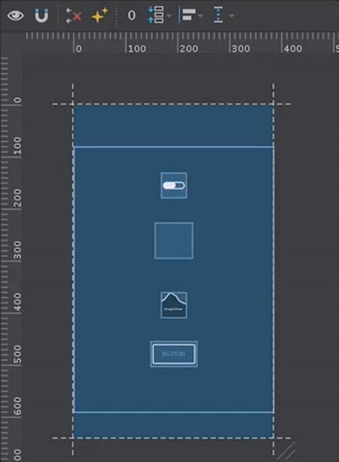
In above image I created five red rectangles. This is the whole visual editor. Before going to explain there is a one question. Is it really important to know about these sections and there names? In my opinion, when we want to do work as an individual at that time we can learn skill by repeating things again and again without knowing terminologies but If we really want to help other community members or may be we want to be a good team player then we should learn all these terms. They are really helpful I will show you now.
I know currently you guys don’t know (may be some of you know 🙂 ). What is Palette, Component Tree, Properties etc but I am going to describe the flow by using these terms, when any developer will start working on UI he always follow these steps.
Take UI component from Palette pane -> Drop on Design Editor -> Change there properties (width, height, text, margin, padding … etc ) in Property pane -> Adjust Constraints on Design Editor.
Total four steps. I am going to repeat again.
Palette -> Design Editor -> Properties -> Design Editor
That is a basic flow which we do 90% in the process of UI creation. Now If any body know these terms, he/she can imagine easily in his/her mind what we are taking about. Now I am going to explain what are these terms which I mentioned above and in Visual Editor where we will get.
Palette:
Provides a list of widgets and layouts that you can drag into your layout in the editor. (Documentation)

Here you will get all UI components given by Android. On top right corner there is a search icon that is really time saving. After search icon there is one more icon settings. Play with that, guys that is really awesome. You can change appearance of UI components according to your personal preference.
Design Editor:
Displays your layout in a combination of the Design and Blueprint views. (Documentation)

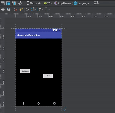
Above image is a Design Editor. In Design Editor we have two modes, one is Design and second one is Text. First we are going to discuss Design mode.
As in above image we have two layouts basically both are same. On left side that is original UI how it look like in device. Right one is called blueprint. That is really helpful when you are doing design. You can easily saw margins, edges and collisions of views with each other. I have one assumption you guys already know how to drag and drop views into Design Editor and how to create constraint with parent and with other views. I am going on a next step.
Now if you saw above image there are some icons. Its time to explain these icons, what are these and what type of benefit we can get from these.
Ok before start, I am giving names to these icons which is easy for me to explain later. I am going to start from left to right. Eye Icon, Magnet Icon, Cross with Arrow Icon, Stars icon, Number box, Pack icon, Align icon, Guideline icon, ZoomIn Icon, ZoomOut icon, Fit to screen icon, Pan and Zoom icon, Warning and Error icon.
 Eye Icon:
This is really helpful icon specially when we have a lot of views on our UI. If that is turn ON, its mean I can see all constraints of the views together. Like I am only managing one Button but I can see all other Views constraints and if that is turn OFF then you are only able to see the constraint of a selected view as shown below.
 Magnet Icon:
This icon will save lot of time. If you know properly how that work. Truly saying I am not good with this icon but here I am describing what I know. If that is turn OFF you can drag and drop or move your views in Design Editor but you need to give your constraints manually. If that is turn ON then lot of constraints with parent view automatically applied by the Editor.

As shown above. First time icon is turned OFF and I move my ImageView to center but nothing happens later I turned ON magnet icon and magic start happening. I move ImageView to center and Editor automatically created constraint for me. WOW
Cross with Arrow Icon:
This icon very simple and awesome. If I want to clear all constraints I can click on this and all constraints will be removed as shown below.
Now as you saw in above image auto connect (magnet icon) is turned ON thats why all constraints automatically created for me. When I moved into center horizontal but in the end when I click cross icon all constraints are removed.
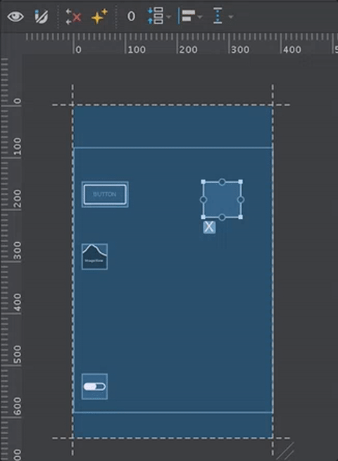
Stars icon:
This is one more really awesome icon. That is basically vice versa of cross ( Clear constraints) icon. I can drag, lot of views on there places where I want without giving any constraints. As I finished I will click this icon and all constraints automatically created for me as shown below. I really like this icon.
 Number box:
This will gave default margin to your parent layout.

 Pack icon:
This icon contain a lot of functionalities. I am going to explain one by one.

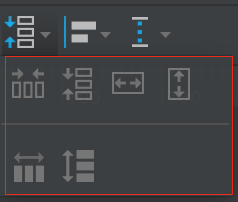
Currently all icons are disable because no view is selected in Design Editor. Here are some icons enable with single view selection and some will work with more then one views selection. First I am going to explain single view enable icons.

When I selected a single view, two icons are enable as shown above. Its time to see what magic they can do.
I clicked left icon and that increased width of my view up to parent edges but remember that is value in dp not match_parent ( parent ). Its mean If I change my screen to more bigger size my view will not shown with the edges of a parent. Same functionality will happen with right icon but vertical. Now both are shown below.

One more important thing. Don’t confuse yourself because when you click width or heigh icon that will increase your view width or height up to first view who is colliding with your view width or height. In above example I have only one view that’s why it go up to parent width and height. In next example I am showing you the other behavior.
Before going to the other icons which are related to multiple selected views. One important point you can use these single view icons with multiple views selection as well as shown below.

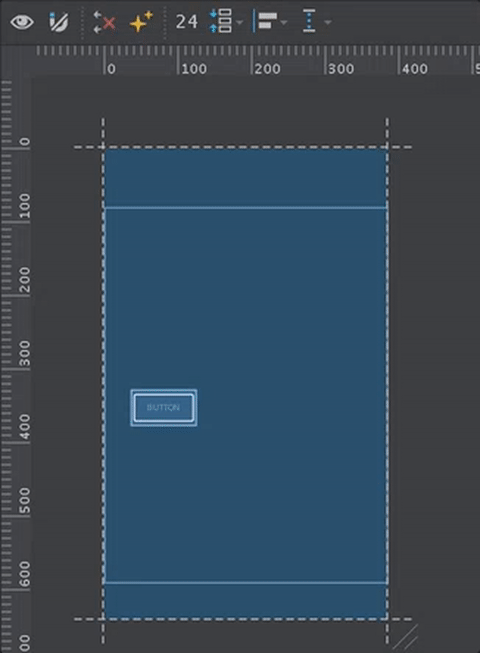
Now its time to learn about those icons which are enable on multiple view selection.

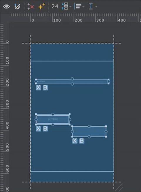
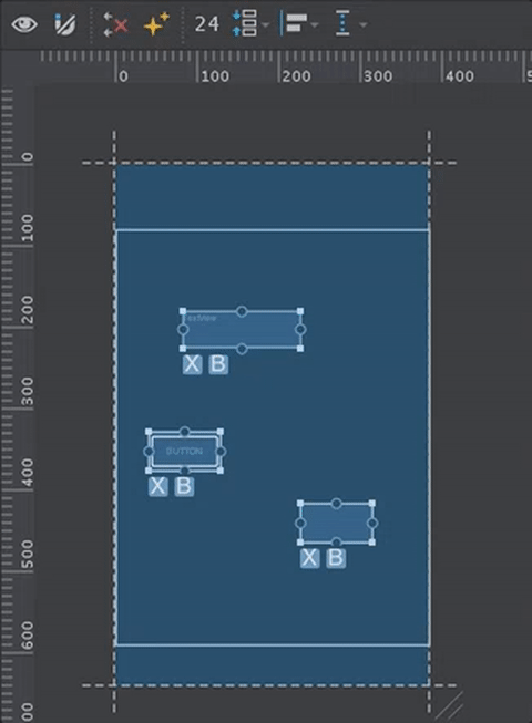
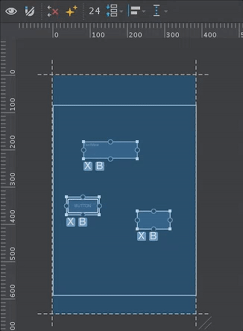
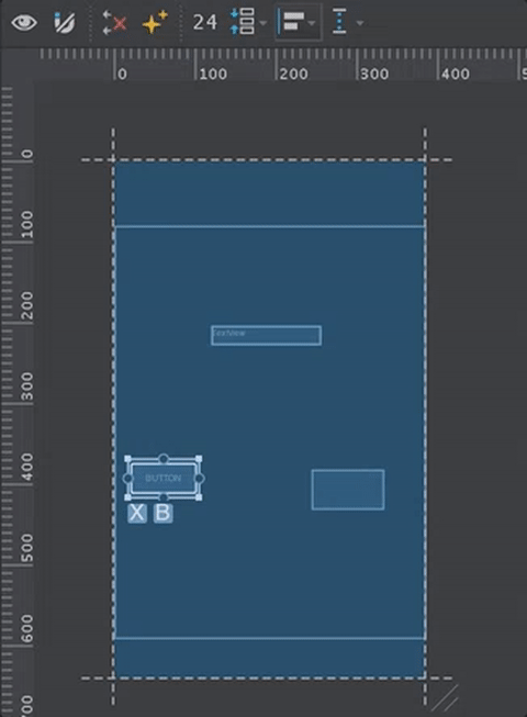
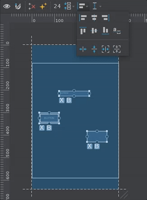
As I selected multiple icons on Design Editor, all other icons are enable as shown above.
Both icons have same functionality only one is used for horizontal and the other one is for vertical. When I clicked horizontal one. That will take all my views and do horizontal align with each other. Then question is what is the difference between above icons which we already learned.
Difference is, above one’s increase the size of our views but this one did not increase the size instead view moved to align to each other. Again important thing that only gave values on Design Editor. If you try to run that on a device you will never get like its shown on Design Editor. For that you need to create constraints on your own. Basically you can save your time by using these icons to align views to each other and later when everything on there required places you can apply constraints. Then you will get your proper result on device. Its time to show you when I clicked what happened.
So its time to explain remaining two icons.
 These icons have again same functionality only orientation differences.
Now If I click left icon basically that will create horizontal constraints between all selected views without moving positions and size as shown below.

Here I can create chain between views by double clicking. If you guys don’t know what is chaining. You can read part2 of the post. In which I explain what is chaining and what benefits we can get by chaining.
Below you can see how you can create chain using Editor.

 Align icon:
This icon contains 11 more icons in popup. In which four will work with single views and remaining work with multiple selected views.

So first I am going to explain bottom four icons which will enable as I select any single view.

First icon will do, view center horizontal, relative to other views with applying constraints.
Second icon will do, view center vertical, relative to other views with applying constraints.
Third icon will do, view center horizontal relative to parent view with applying constraints.
Fourth icon will do, view center vertical relative to parent view with applying constraints.
All icon functionalities are showing below respectively.
Now remaining icons which are enable for multiple views selection.
Top three icons:
First icon will align, left edges of my views in horizontal fashion with applying constraints.
Second icon will align horizontal centers of all views with applying constraints.
Third icon will align, right edges of my views in horizontal fashion with applying constraints.
All icons functionalities are showing below respectively.
Bottom four icons are also same only they work in vertical fashion.
 Guideline icon:
As we already discuss Guidelines in part2. What are they and how we can get benefit. Here I am only going to show you. How you can add guidelines in your UI because these are not views. So for that we have this guideline icon, by using this we can add guidelines as shown below.
 ZoomIn, ZoomOut, Fit to screen icon:
My assumption is every body know these icons functionality so I am going to next one.
 Pan and Zoom:
This icon is useful when I am doing my work on a very high level of zoom and I want scroll my UI as shown below.
 Warning and Error icon:
This one is useful as I am going to create my UI. I can see if any error or warning occur by clicking on this icon.
Good news. We completed our Visual Editor in Design Mode. Now its time to see how I can work in Text Mode.
In Text Mode basically you can do all things which currently we did in Design Mode except property changes using Editor and additionally we are able to write XML.

Toolbar:
Provides buttons to configure your layout appearance in the editor and to edit the layout properties. (documentation)
In toolbar I am going to explain only first three and last icon. All other icons are available from day. I think every body know all other icons.
 Design View Mode Icons:
First one show us the original UI layout.
Second will show us blue print of our UI layout.
Third will show us both together.
All icons functionalities are showing below respectively.

 Layout Variant Icon:
This is really helpful icon if I want to create different layout files for different variants. Like I want to create separate Land scape layout. So without going into File I can create from here in seconds just as shown below.

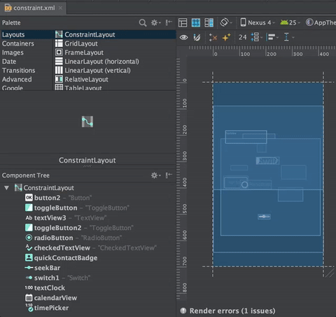
Component Tree:
Shows the view hierarchy for your layout. Click an item here to see it selected in the editor. (Documentation).
This pane is really helpful specially when I am doing my work in Design Editor and I have a lot of views in the form of a stack. Its really difficult to select some view which is behind to some other view. In these type of situations I always use to select my view by using this palette as shown below.
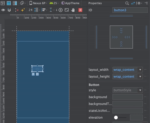
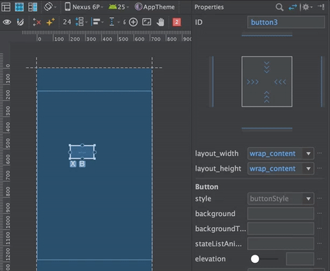
Properties:
Provides property controls for the currently selected view. (Documentation)

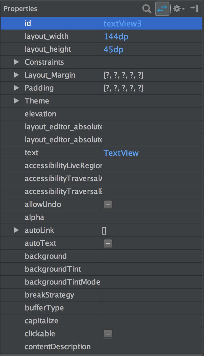
In Palette we have two views as shown in above images. Here I will explain the first top image because the second bottom image is available from day one in Android Studio. So I have an assumption every body knows about that property pane. About how you can swap these views for that check below image.
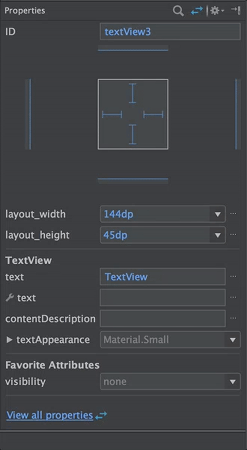
Its time to learn first property pane view new things which are shown below.

There are two main things which we are going to explore. First the internal square which is used for view size. Second are blue lines outside of that internal square. These are used to manage our view constraints.
Internal square:
Internal square we can see in three forms.
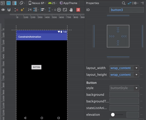
1. Wrap content:

Just like in all views we have a wrap_content concept that is same here. Only now we can do by using Design Editor just shown below.
Here I took a one button which is match_parent, match_parent and later by using UI i changed to wrap_content, wrap_content.
2. Fixed size:

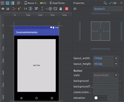
Fixed size means like we gave values in dp to width and height. Now we can do by using UI as shown below.
Here I took a one button of wrap_content, wrap_content then I changed that to fixed size and after that I change size by dragging on UI.
3. Any size:

Any size is really useful when we are going with constraints. Like if I did not set any constraint on view and then do a any size, view will be 0dp,0dp as shown below.
Now I am going to apply left and right constraints on the button and later I will change its width, height to any size and button will take whole space as shown below.
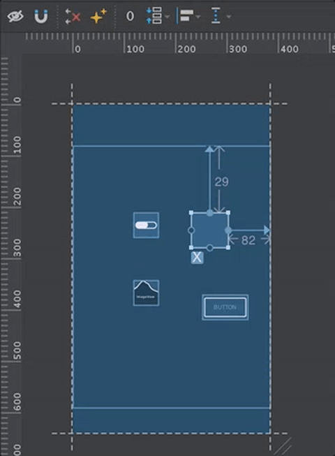
Now its time to learn about view constraints value management.

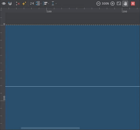
In above image all read rectangles basically contained the constraint management UI of a selected view.
Used of these lines are shown below.

In above image I have a one button. I apply first left constrained on that button with 24dp. Later I changed to 207dp and in the end I removed constraint by clicking on a circle. One important thing basically these values are not constrained instead these values are margins :). Only you can apply that after applying constraints.
OK guys its time to say BYE. I hope you enjoy all of my Constraint Layout ( What the hell is this ) series of tutorials. Today we completed all aspects of a Constraint Layout according to my knowledge.
Next time we will meet with some new topic. BYE. Have a nice weekend 🙂 .
 by
by 